

How to Keep Your Website Responsive in 2023
What You Need to Know About the Future of Responsive Design
Today a company’s website is a critical marketing tool that can make or break its growth. With the constant evolution of technology, it becomes imperative that your website keeps up with the latest trends and meets the increasing demands of your customers. This means your website needs responsive design that can automatically adapt to the screen your client is using.
At WM Marketing, we understand the importance of meeting your clients’ needs and expectations. More than ever, consumers are using mobile devices to research and retain a company’s services. Our team works tirelessly to put usability across devices at the forefront from design consultation to launch.
Are you ready to take your website to the next level? Contact us today to get started.
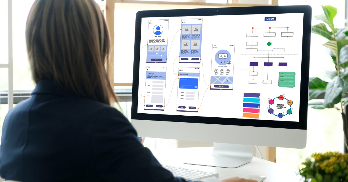
What Is Responsive Design?
Responsive Design is a modern design concept that enables websites and pages to render (or display) on multiple devices and screen sizes by automatically adapting to the screen.
Why Your Website Needs Responsive Design
Traditionally, websites were designed for a singular device, such as a desktop. The problem is that today there are hundreds of unique screen sizes and resolutions, not to mention countless different browsers.
Consumers expect a website to adapt seamlessly to the screen that they are using, including (and arguably most importantly) mobile devices. According to the latest data, nearly 60% of global website traffic in the 2nd Quarter of 2022 came from mobile devices.
Responsive design, done correctly, means that your website will automatically adapt to the size of the screen regardless of whether they are viewing the page on a desktop, laptop, or mobile device.
What Happens If Your Website Is Not Responsive?
First, it is important to note that websites are not automatically responsive. Responsive design is accomplished through intricate coding.
A website that is not responsive or optimized for multiple screens and resolutions may not be readable on all devices. As a result, it may be difficult for your client to read your website and many potential customers could move on to your competitor.
A website with responsive design ensures an improved user experience for your clients. It may also eliminate broken buttons, inaccessible sections, and a perceived lack of professionalism.
How We Can Improve Your Client’s Overall Satisfaction
At WM Marketing, we offer responsive coding on all websites we design. The world of responsive design is ever-changing, and you need a company that will have its finger on the pulse of those changes. We stay on the cutting edge of responsive design research, ensuring that your website is interactive, fast, and reliable regardless of the screen or browser your client is using.
Ready to Improve Your Rankings and Grow Your Company? Contact Our Office Today.
If you want to ensure your website is easy to navigate regardless of the device your client is viewing it on, you need responsive design. At WM Marketing, we make user experience a priority in all of our website designs, from the initial concept to the final launch. Contact our office today to discuss how we can make 2023 your best year to date.


